
OUR BRAND
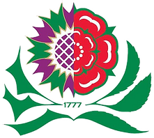
Given that our directors Shona and Andy are one part Scottish and one part English, the Thistle and Rose was seen as a fitting image to represent the company for various reasons. At that time the brewery was in the border town of Berwick upon Tweed, England, but they lived win Scotland.
When we moved to our present home we rebranded and the designer reverted back to the Thistle and Rose but we incorporated the HB within it. 5 years on we still like this logo it is graphically flexible and can be produced in full colour or monochrome and is regularly used in different formats and colours.
When we moved to Tyneside and changed the name we produced a simple HB which in time
become a slightly more interesting hb.


A few years later we engaged a ‘proper marketing company’ to modernise us, they chose to run with the Thistle and Rose and went abstract.
The original logo was drawn by an artist friend of ours who scoured the banks of the river Tyne in East Lothian for a suitable thistle to draw.
